Pradlerstra the preparation of the text
Important stage – preparation of sources. These include: text, illustration, and various graphic elements.
Book layout – a kind of art. Even visually, the layout of the collection of fairy tales with curly font and lots of illustrations is very different from the location of layout elements in the scientific literature. Knowing the contents of the material are selected and approaches to layout.
The text must be proofread for mistakes, typos and double spaces. It is to admit, the Lite version and proofreading edits. A deeper study of the text will require special knowledge, skills, and perhaps, competent work a qualified proofreader whose services in the layout of the book will not be superfluous.
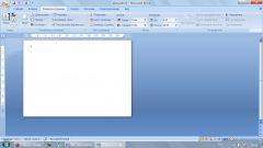
Settings
In Word start a new document and open the tab: File – page setup. In the tab "Fields" set to 2 cm for both the upper, inner and lower fields. The logic is the following – standing default settings optimized for documents, not suitable for the book. Wide left and top edge of the print books will bring down text when linking pages, which will affect the design.
Then you should specify landscape orientation, and position "Page" select "Mirror margins". So the page when the stitching will be facing each other.
The settings you need to apply to the entire document.
Set the page number in the Align box, specify the "Outside". The layout of the book will look more attractive if along with the page number in the footer will indicate the name of the book. To insert it into the field, you double-tap to activate the field header and enter the name of the book on one of the pages. The change will be applied to the whole document.
The template is ready. Now it can be filled with content.
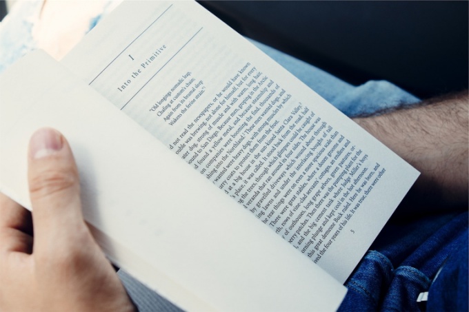
The fill of the text
The layout of the text begins with the title-page. Its back side can be left blank or set aside for the epigraph, the speech of the author or a summary of the book – synopsis.
Then filled the main text by chapters. For the design of the headers is better to use styles, or invent your own – bold, italic, font size and line spacing.
It is important to remember that the use of multiple fonts in one document often looks bad, so it's best to opt for a single font.
Following the text are illustrations, accompanied by comments where it is needed.
The last page is traditionally reserved for content words from the author and the source data, if necessary. After that the book again to review for errors in layout and dangling strings, and then print.