Instruction
1
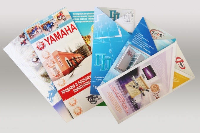
Booklet and other printed products, carries information about the organization, some services a specific project or event. Therefore, the layout of the bookletand begins with the collection of information for him. This photo, logo and contact details of the organization, whose text in the booklet usually includes one to two pages.
2
Of particular importance in the booklet, e plays the background defines the color mood of the entire product. If you have any problems with the choice of background that happens to beginners quite often, it is better to see the finished booklets, within arm's reach, or find examples on the websites of the publishers, and thus to determine the desired color scheme. Then it will be easier to choose photos for the background.
3
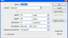
The layout of the bookletand is posted on two pages – external and internal, which in photoshop is done in two different files. Work on each of them begins with the creation of a document of format A4, landscape orientation. On all four sides of the pages of the guide are cut off by 5 mm is the edge that fall in the printable area of the printer and can later be cut off. Also guides the working area of the pages is divided into three identical columns.
4
Middle and right column of the outer page is a kind of "cover" of the bookletand which are documented in more vivid colours. While the right – front and middle – back. The front side should contain the main information bookletand the logo and name of organization, name, center the photo, if necessary, in the bottom middle are the year and place of issue. On the back cover usually lists the contact information for the organization. The left column of the outer page bookletand thematically more relevant to information on its internal pivot and may contain issues or the relevance of his themes, and in some cases, the result of the basic material.
5
The inner side of the bookletand contains a full disclosure of his subjects, and consists of text, in a font not less than 6-th pin, and photos, the dimensions of which it is desirable to do the same. For easier perception of the information text can be divided into sections and lead their small headers.
6
When all the material has settled on the pages of the future bookletand it's time to bring it to a draft print, trim if necessary, the edges and fold. The paper is folded, you will see all bugs, including spelling mistakes.
7
The text should be easy to read and carry useful information – is too small no one interested, and the lack of food for thought will not leave in the memory of the readers a good impression. Material, particularly text, should be placed in the center of each of the columns, i.e. to be on equal distance from the bend lines and edges of the sheet. Also the ugly look of the pictures on the very edge and folds on the booklet.
8
Correcting your flaws, show your art to someone, there are certainly a couple of comments, seen with fresh eyes. And only after your booklet has become kind of publication, which like you and others, it can be put into fine print.


