You will need
- - a series of distributions of the dependent and independent variable.
- paper, pencil;
- - computer and software to work with spreadsheets.
Instruction
1
Select the two variables between which you suspect there is a connection, usually taking values that change over time. Note that one of the variables must be independent, it will act as the reason. The second must change synchronously with it will decrease, increase or vary randomly.
2
Measure the value of a dependent variable for each independent testimony. Record your results in a table, in two rows or two columns. To detect the presence of when you need at least 30 readings, but for more accurate results take care of not less than 100 points.
3
Construct a coordinate plane, with the y-axis put the value of the dependent variable, and the x – axis is independent. Sign axis and specify the units of each indicator.
4
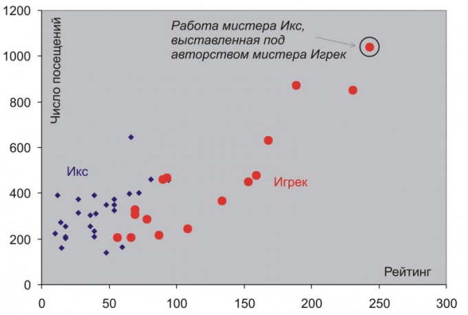
Note on the chart the points of the correlation field. On the x-axis, find the first value of the independent variable and on the y – axis the corresponding value for the dependent. Construct the perpendiculars to these projections and find the first point. Mark it, circle with a soft pencil or pen. Likewise, build all the other points.
5
6
Note the random deviations from the schedule. If in General, there are traces of linear or other relationship, but the whole "picture" spoil one or two points, find themselves aloof from the General population, they can be considered random errors and not to be considered when interpreting the chart.
7
If you need to build and analyze the field correlation for large amounts of data, use programs designed to work with spreadsheets, such as Excel, or purchase a special program.


