You will need
- The table editor Microsoft Office Excel 2007 or 2010.
Instruction
1
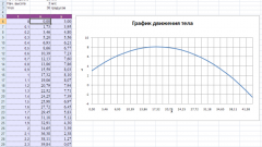
Start Excel and load the document with the correct table. If the data dependence which is necessary to display adjacent rows or columns of one sheet, select them.
2
On the Insert tab on the Excel menu, open the drop-down list of "Point" - it is placed in the middle of the right column of icons of the group of commands Charts. This list contains schematic representations of different types of charts from which to choose the most appropriate to display the interdependence of data from your table. Then Excel adds in edit menu three tabs to work with the schedule, combined with the title "Working with diagrams".
3
If the first step you have selected the columns, the graph will be built automatically and this step can be skipped. Otherwise, it will be created only an empty region. Click "Select data" command group "Data" on one of the added tabs Design. In the opened window click "Add" under "legend entries (series)" and Excel will show you another window containing three fields.
4
In the field "series Name" specify the graph title, e.g. click on the cell with the name of the data column. In the next field - "X-Values" - put the address of the range table, which contains numbers that identify the distribution of points along the x-axis. This can be done with the keyboard or select the desired cell range with the mouse. The same thing, but for the data on the y-axis, proceed as in the "Y Values".
5
Click OK in the two open dialogs, and the graph of dependencies will be built.
6
Using the control elements on the tab "Layout" and "Format" menu of the table editor to customize the appearance of generated graphics. You can change the colors and fonts of the labels of the graph, and appearance of the substrate. It can give volume, change the shape, set the color and fill effects, select texture, etc.