Instruction
1
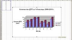
To build the chart in Excel, enter the required data in tabular form. Highlight their full range and click on the "chart Wizard" on the toolbar. A similar effect happens if you select the menu "Insert" command "Diagram...".
2
In the window that appears, select the appropriate chart type. Some of the chart types to choose depends on the information that illustrate the input numbers as well as your personal taste. Complicated statistical series look good in the form of a simple histogram, which can then give a three dimensional look. At the same time, simple percentages and tables consisting of two columns, adequately perceived in the form of a pie chart as the chart with the selected sectors.
3
The following settings window will specify the ranges of data used. To build the chart in Excel, enter the signature of the X and Y axes if necessary. Additionally, specify whether to add a legend to the chart and the data labels. After you select the location of the chart on the same worksheet, where the table itself with the data or on a separate Excel worksheet. In the latter case, the table will occupy all the space of the new sheet, and when printing it massturbate on full size paper.
4
Later you can change the appearance and customize the chart by clicking on it the right mouse button and selecting in the drop-down list one of the commands: type, source data, options and location.