Instruction
1
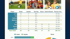
Start Excel and enter the data on the basis of the created histogram. Select the range of cells, including the names of rows and columns that will be used in the chart legend.
2
Go to the Insert tab. On the standard toolbar under "Graphs" click on thumbnail Histogram. In the drop-down menu, select from the options the pattern that is best suited for your purposes. The histogram can be conical, pyramidal, cylindrical, or look like an ordinary rectangular column.
3
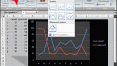
Select the created histogramby clicking on it with the left mouse button. Will be available in the context menu "charts" with three tabs: Design, Layout and Format. To configure the appearance of charts on your own – to change the type of positioning data in a different order, choose the right style, use the design tab.
4
On the Layout tab edit the contents of the histogram: set the name of graph and coordinate axes, define whether to display the grid and so on. Part of the operations you can perform in the window of the graph. Click, for example, on the field "chart Title" with the left mouse button, the specified region will be highlighted. Delete the existing text and enter your own. To exit the edit mode of the selected field, click the left mouse button anywhere outside the selection borders.
5
Using the tab "Format" to adjust the size of the histogram, pick the color, contour, and effects for shapes using the corresponding sections on the toolbar. Part of the operations chart can also be performed with the mouse. So to change the size of the area of the histogram, you can either use the "Size" or move the cursor to the corner of the chart, hold down the left mouse button to draw the contour in the right direction.
6
Configure the histogram you can use the context menu via a right-click of the mouse on the region of the histogram. If selected, the entire diagram will be available to the General settings. To edit a specific data group, first select it, then in the drop down menu options appear for selection.