Instruction
1
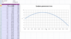
Before building the graph, create a table that contains the original data and highlight it in any cell. Next you can proceed in different ways:
- in the menu "Insert" select "Chart";
- on the toolbar click the "chart Wizard";
- press the F11 key.
Excel will create a chart on a separate sheet using the default settings. Since the default chart is built, go to menu "Graph" main menu and expand the "chart Type" to choose the line chart.
- in the menu "Insert" select "Chart";
- on the toolbar click the "chart Wizard";
- press the F11 key.
Excel will create a chart on a separate sheet using the default settings. Since the default chart is built, go to menu "Graph" main menu and expand the "chart Type" to choose the line chart.
2
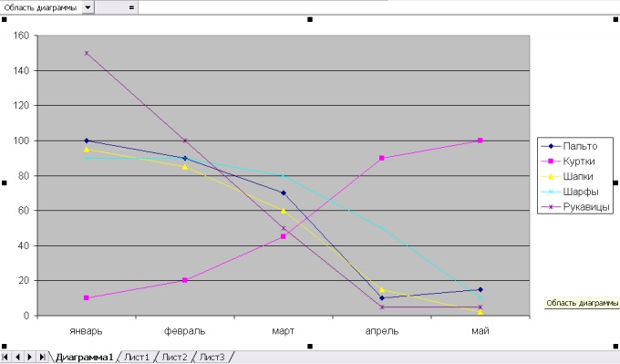
Select list Type" item "Schedule". In the chart Wizard 2 tabs: "Standard" and "Nonstandard". Among custom charts Excel offers combined, for example, a graph histogramme or chart with two value axes. Click "Next".
3
In the tab "Range" specify the range of values used to build the graph. By default, the program considers the entire table. Under "Series in" select which value will be indicated on the x-axis: columns or rows. To continue, click "Next".
4
Set the chart options:
- in the tab "Headers" – the name of the graph and the titles of his axes;
- "Legend" – placement of a legend on the worksheet regarding the graph;
- Data table – whether simultaneously with the schedule of the show table;
To move to the next step click "Next".
- in the tab "Headers" – the name of the graph and the titles of his axes;
- "Legend" – placement of a legend on the worksheet regarding the graph;
- Data table – whether simultaneously with the schedule of the show table;
To move to the next step click "Next".
5
Specify that will host the chart: on a separate sheet or on the current working.
6
If you want to change the thickness and color of lines on the chart, highlight the data series and in the main menu open item "Format". Click "Selected range". In the "Format data series", switching to the appropriate tab, change the appearance of a chart line and marker. You can choose the color and thickness of lines and the geometric shape of the marker; add a legend, and data labels; construct projection lines on a coordinate axis, etc.
Note
In Microsoft Excel 2013, you can quickly show a chart like the one above, turning your chart in combination. Click the diagram you want converted into a combination to open the tab charts. Click design > Change chart type.
Useful advice
When you open the chart wizard, Microsoft Excel chooses the default chart type "Histogram". If you chose a different type on the basic tab, click Preview results (and holding it), you can see a Combination chart that combines a bar graph with the graph. If on the same graph you want to display different categories of information, use a combination chart.