Instruction
1
First, make the desired table. Assume that the graph has two axes – horizontal (X-axis) and vertical (Y-axis). Accordingly, in the table that are columns and rows. The name of the columns and rows in the future will be the name of the axes. An example of a table.
After the table is built, select it and click the "chart Wizard". By default, it is located on the standard toolbar next to the help icon. Window opens the "chart Wizard-step 1 of 4: chart type". In this window, select the graphics option that suits you best. To learn how your data will look in a particular embodiment, there is a button "View results". Click on it and hold some time on place "the View" will be displayed graph for your table. If the standard chart was not needed, look at the tab "Custom".
After the table is built, select it and click the "chart Wizard". By default, it is located on the standard toolbar next to the help icon. Window opens the "chart Wizard-step 1 of 4: chart type". In this window, select the graphics option that suits you best. To learn how your data will look in a particular embodiment, there is a button "View results". Click on it and hold some time on place "the View" will be displayed graph for your table. If the standard chart was not needed, look at the tab "Custom".
2
Having defined the type of chart click the Next button - go to step 2. In the upper part of the window a sample of your future schedule, then the range is selected area. If you forgot to select a table first, or change the allocation – change here. Also, changing the pointer "Series in rows/columns, you can change the data in X and Y. the Result is visible immediately, if you don't like it, return it.
3
In step 3 you can set all the necessary parameters: designation of the axes, the color and thickness of lines, fills, markers, font, etc. including here, in the tab "Legend", create it (by putting a tick in the appropriate box), specify the position relative to the chart. The legend needed in order to see what data is on the chart that mean. You can also attach to the schedule table data.
4
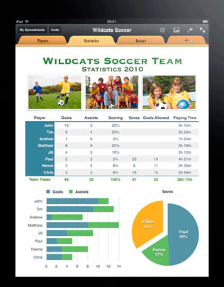
At the final step, select how you want to see a created graph, chart on the same worksheet where the table or the other (can select any existing worksheet in the workbook or create a new one). After selecting, press "Finish". Your schedule will look like.
5
If for some reason you are not satisfied with the result, it's easy to fix. Fix the schedule you can right in it (click the right mouse button's context menu or in the main menu "Chart". Subparagraphs of this tab contain all four of the above-mentioned step.
Now you know that by changing the data in the main table and immediately get the updated schedule. Benefits on the face – no need to make a new graph, update it at least every hour. It is on this principle are formed the various daily, monthly, etc. reports vividly and clearly.
Now you know that by changing the data in the main table and immediately get the updated schedule. Benefits on the face – no need to make a new graph, update it at least every hour. It is on this principle are formed the various daily, monthly, etc. reports vividly and clearly.