Instruction
1
Start Microsoft Excel and load the spreadsheet containing the data to plot. Or create a new document and fill it with necessary data.
2
Select the spreadsheet cell range upon which you want to graph. In addition to the data itself, you can highlight the column with the row that include the title. In this case, the values from the cells of the left column will be marked dividing the horizontal axis (X-axis) of the graph, and the values across the top row in the legend will be signed the corresponding line graph. It is recommended that the number of columns of data, and therefore the number of lines simultaneously displayed on the chart, it was not more than seven.
3
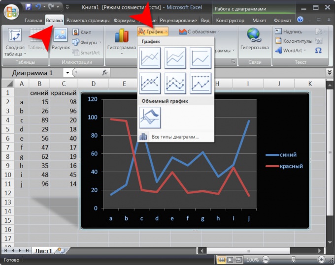
Select the menu table editor the "Insert" tab and click "Chart", placed in a group of commands "Diagram". In the popup list of seven design options and choose the most appropriate. The table editor will be based on your chosen layout graph constructed from the data in the selected cells of the table. They will use the installation default skin. To change Microsoft Excel will add a tabs menu three "Designer", "Format" and "Layout".
4
Replace the scheme used by the table editor when you create graphics if needed. On the "Designer" is a drop-down list of "chart Styles" and "chart Layouts". In addition to selecting the preset options, you can based on them to create your own version of the design graphics using posted on the tab "Format" and "Layout" tools.
5
Save the edited version of the design graphics if you intend to use it in the future. On the design tab, use the button placed in the group of commands Type". In the group of commands "Data" there is an icon that swaps the axes, that is, transporoute data. Another button in this group of commands designed to change a range of cells, based on which the graph was built.