You will need
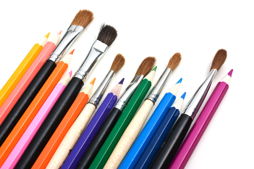
- A sheet of drawing paper, gouache, markers, photos, pictures, pencil, watercolor, applique
Instruction
1
Plan the location of title, text parts, drawings. On the centerline place the most important materials in the periphery – complementary data. Do the compositional center of the picture, the most interesting text.
2
Pick a color scheme. Either soak the contrast of tones, or use close to each other shades. Avoid excessive brightness of the headers and frames and fancy color combinations. After all, the laconic coloring is more convincing than the redundancy of colors.
3
Pay special attention to the fonts of the text and the title. They should be designed in the same style, even if they vary in color and size.
4
The location of the headers depends on the amount of text. But in any case, the texts divide into meaningful parts, each of which create your header. Place units symmetrically but asymmetrically, and the rows on one line from the edge of the sheet.
Note
Rectangle poster sheet does not fit well with the compositional structure, which is based on round, oval and arc.
Try to avoid unnecessary use in the text of conjunctions and prepositions. They razbalansirovat balance strings, which reduces the visual comfort when viewing the poster.
Try to avoid unnecessary use in the text of conjunctions and prepositions. They razbalansirovat balance strings, which reduces the visual comfort when viewing the poster.
Useful advice
Observe the alignment of all the components: don't let stand out secondaries and not "shade" of the main.
Most just place a poster using markers and pencils. But the most beautiful, bright, original work all the same posters, the creation of which used watercolor and gouache.
Most just place a poster using markers and pencils. But the most beautiful, bright, original work all the same posters, the creation of which used watercolor and gouache.
