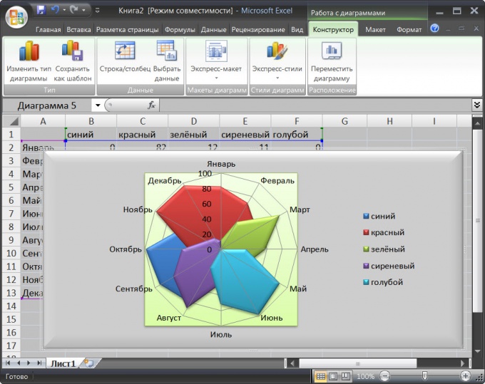
Instruction
1
Run the table editor and load a document whose data must be represented in the format of a radar chart.
2
Select the range of cells that you want to include in the chart. If this range contains the column headings and columns, they can also be highlight - Excel will be able to distinguish labels from data cells, and include in chart as legends and labels to the sectors. It is desirable that the number of columns with data does not exceed seven - that is the recommendation of Microsoft Corporation.
3
Click on the "Insert" menu in the table editor and the command group "Diagram", click "Other charts". The bottom line the drop down list placed three options for radar graphs - select the one you want. Excel will perform the necessary actions and put the finished figure on the same page of the document. While in the menu editor adds three additional tabs used to edit the chart - "Layout", "Format" and "Designer". The default activated tab "Designer".
4
Open one of the drop down lists in groups and teams "chart Layouts or chart Styles" if you want to change the appearance, used editor to create the chart. These lists are placed ready design options and in the tabs "Layout" and "Format" you will be able to customize almost every aspect of the appearance of a radar chart is to choose the color, relief, material, shading, color fill options, move labels or disable them, etc.
5
Use the buttons in the command group "Data" tab the "Designer", if you want to change the cell range that is used for the formation of charts, or row and column containing the headings of the legend. In the group of commands Type" - on this tab, placed button to save your created styles as a template and a button replace the radar charts on the chart of any other type. Button in the command group "Location" buttons to move the chart within the current worksheet or on other worksheets in the workbook.