Instruction
1
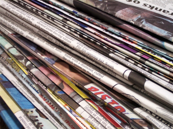
Layout always match the "format" of the newspaper and the interests of its readers, of course, the publisher takes into account its own interest. For example, serious publication is placed on the cover of "main theme" and the material enlightened her sent to "the interior" rooms, on the reverse. Ever wonder why? Flipping through the newspaper, you will have time to catch the look and other materials. About main write, but there is a possibility that until you get to the bottom, you'll see a category for that buy a newspaper next time. So, the basic principles of layout: the main thing – on the cover, the rest is a matter of "categories". This system of placing the recurring themes of the newspaper strips. For example, if you publish a newspaper about the life of the city, on the first page can be notes about the initiatives of the city Assembly and city hall. After, sections on social problems. Then turn (main theme). Now you can move on to other topics.
2
Let's say you have stories on the following topics: new traffic rules, the accident in the area, the President's speech at the international summit, the raging wildfires in your country, but away from home city; the star, who gave birth to a son.If your publishing business and you write only about politics and Economics, the layout will be the following. Page one: the President's speech at the international summit (reversal). Second strip: natural fires. Third, a new SDA. The fourth accident in the area. And from "star child" you simply refuse, no format. Otherwise it will be the case if your niche is entertainment media. The first band – photograph stars with a newborn, "accident", you might not fit, "international summit" you can put pictures, not a Protocol, if not, better give up theme.
3
But all this concerns the structure of the publication. Unfortunately, the concept of "layout" this is not the end. So the newspaper took on the form we need to deal with a few things.
The reader should be "news". There are different ways. You can put the beginning of the article on the front page and provide a link for the continuation on another page. "Hitch" audience cuttings, offsets of the header and footer, byline, add blocks with interesting opinions on the subject, well-placed photos from the event, sign image.
It is important to remember that the room should be a few "shock" bands. This will help to make the composition, you should always understand what to highlight and what to leave on than to focus the reader's attention. Help in this design. Everything matters: from the paper (what it will be glossy or dull, thin or thick), to colors of the logo and design of rubrics. Space the imagination limits the audience, and your format. If the publishing business from the playful colors and gloss should be abandoned.
4
In addition, the design includes the size of your publication. Huge standard newspaper thing of the past. To read them in public transport is becoming more difficult because Newspapers approach magazines. A2 reduced to A3, this newspaper is easier to carry in your purse or briefcase. Now we have a practical edition of the A3 with a "bright" first strip. It is a great shot, "killer" headline. By the way, article titles are often associated failing sales. The title should reveal the essence of the article and at the same time to attract attention if the essence is not clear, the publication will remain on the shelf in the store. You should also consider the font. That it could become the hallmark of the newspaper. But most importantly, he must always remain readable. Your audience should not strain your eyes in order to understand what you are trying to communicate.
5
To summarize: the first band is the main thing that you have; below the main navigation of your newspaper; design inimitable style, the song helps to reflect the main thing in the room; clear and vivid headers will keep the reader; user-friendly format will ensure ongoing sales.

Useful advice
As Adobe InDesign, QuarkXPress, Adobe Illustrator will help to implement his plan.