You will need
- - gouache;
- brush;
- - landscape sheet.
Instruction
1
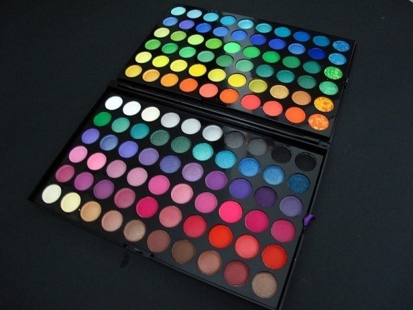
First of all, remember that there are three primary colors: yellow, red and blue. Of these, the first two to warm, the latter cold. All other colors and shades thereof. They will be "warm" or "cold" depends on what and in what proportions they mixed the base color. For example, orange is warm because it is obtained from the warm primary colors of red and yellow. Blue, by contrast, is always cold, as it is based on diluted blue. Green is traditionally considered neutral because it is formed by their blue and yellow, but shades of green, dominated by one of the colors belong to the warm or cold spectrum depending on the dominant color.
2
Warm colors evoke associations with summer, sun, fire, and cold with winter, snow, ice. At the basis lies the warm shades of yellow, the basis of cold is perceived as white. If you susceptible to the influence of colors, you'll notice that looking at a warmer shade, you feel a surge of energy, excitement, and looking for a cool, calm down, start thinking rationally. Spatial cool shades perceived to be more distant from the viewer than are warm.
3
Practice mixing primary colors to better determine how is a particular color or shade. To do this, take the jar with red, yellow and blue gouache and a sheet of landscape. As a visual aid, use the chromatic circle, examples of which can be found on the Internet. Learn to determine the composition of the color accurately on the eyes.
4
Keep in mind that the perception of shades is largely influenced by the color of their environment. For example, if you put two patches of color "cadmium red" and "Carmine", the first will seem warm and the second cold. A similar example can be quoted from other parts of the color spectrum: a neighborhood with blue makes purple seem warmer, the neighborhood red – cold.