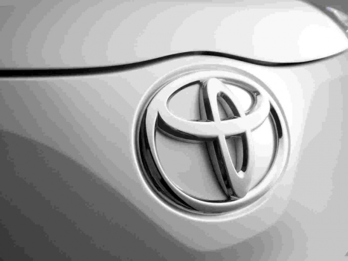
It is known that the logo has the company not only gives recognition, but also expresses the concept of doing business, reflects the mission and role of the company in the market, its philosophical views and perspectives. The logo needs to convey to consumers the important information. Be recognizable in the end.
The unofficial version says that the emblem of the Toyota group of companies represents a stylized image of a textile loop, but it is possible to meet opinion that this kind of sewing needle, in the eye of which is threaded the thread. Representatives of the company such versions do not comment, considering that the emblem and the Toyota brand means nothing else as the forward movement and transition. The basis of this version, which, incidentally, is poorly correlated with a visual image, put the history of the company. Because of the family business Toyota rose to the company that would become famous all over the world.
Until 1936 the company was called Toyoda Automatic Loom Works Ltd, which was advanced at the time of issue of electronics. However, the development of business and changes in the product line demanded to change the name and concept of the company.
We've seen the launch of car production, and had to create a new brand. Marketers have been tasked to create a memorable logo for the company and vehicles produced on site. The management has decided to arrange competition on the best logo for brand promotion, the main requirement of which was that the design was attended by a reflection of sense of speed.
The result of this competition has changed the company's name, the word Toyota is considered acceptable to the sick mark on the Japanese. The Japanese are also very superstitious, and the writing of the word requires exactly eight strokes in Japan, this number is considered a symbol of luck and brings prosperity.
Now the logo is more a symbol of the company, because in its original form on the product it is not used. But the Corporation uses its emblems, and all employees are issued badges with the logo image.
In the modern version of the logo consists of the Latin names of the company and three ovals, two of which symbolizes the trust between consumers and producer. The logo uses two colors – white and red.
Also if you look closely, the logo resembles the letter T, which is the first in the name of the Corporation (Toyota).
It is believed that the company logo Тoyota has a great philosophical meaning and conveys to the consumer the idea of universal progress and positive development.
The unofficial version says that the emblem of the Toyota group of companies represents a stylized image of a textile loop, but it is possible to meet opinion that this kind of sewing needle, in the eye of which is threaded the thread. Representatives of the company such versions do not comment, considering that the emblem and the Toyota brand means nothing else as the forward movement and transition. The basis of this version, which, incidentally, is poorly correlated with a visual image, put the history of the company. Because of the family business Toyota rose to the company that would become famous all over the world.
Speaking about the visual expression of the idea company, you need to understand that we are talking about the Eastern culture of art and tradition of writing. Not the Toyota emblem we measure by European standards.
The history of the company
Until 1936 the company was called Toyoda Automatic Loom Works Ltd, which was advanced at the time of issue of electronics. However, the development of business and changes in the product line demanded to change the name and concept of the company.
We've seen the launch of car production, and had to create a new brand. Marketers have been tasked to create a memorable logo for the company and vehicles produced on site. The management has decided to arrange competition on the best logo for brand promotion, the main requirement of which was that the design was attended by a reflection of sense of speed.
The result of this competition has changed the company's name, the word Toyota is considered acceptable to the sick mark on the Japanese. The Japanese are also very superstitious, and the writing of the word requires exactly eight strokes in Japan, this number is considered a symbol of luck and brings prosperity.
Modern meaning a symbol of the company
Now the logo is more a symbol of the company, because in its original form on the product it is not used. But the Corporation uses its emblems, and all employees are issued badges with the logo image.
In the modern version of the logo consists of the Latin names of the company and three ovals, two of which symbolizes the trust between consumers and producer. The logo uses two colors – white and red.
Also if you look closely, the logo resembles the letter T, which is the first in the name of the Corporation (Toyota).
In simplicity there is more free space in the logo signify its global expansion and high potential.
It is believed that the company logo Тoyota has a great philosophical meaning and conveys to the consumer the idea of universal progress and positive development.


