The fonts are not embedded in the page. The contents of the code simply indicates that the user needs to display a particular design. Experienced coders indicate several suitable options. If one font is not – will seem different.
Also, the design sometimes changes depending on the device. For example, you can configure the site so that mobile users, he showed one font (more compact and readable on small screens), and the owners of other tablets.
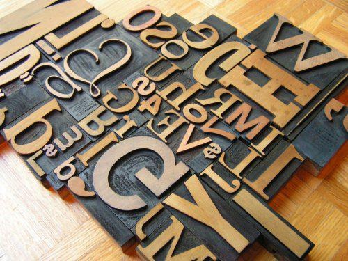
The design should not be too diverse. In most books on usability of Internet resources it is said that optimum use of 3 different font on the website. If there are more, the design looks too inharmonious.
For content it is better to choose a sans serif (grotesques). On screens and monitors, they are perceived much better. Fonts with serif (Antiqua) are mainly used in headlines or printed materials.
The most popular choices include Arial, Trebuchet tenth pin for main content vs. Georgia, Times New Roman twelfth pin of the headers. This is due to its prevalence and ease of reading. But the Impact and Comic Sans, despite its popularity, is not recommended.
Another good option is font Verdana. Visually it is similar to Arial, but has a more subtle contour. Keep in mind that this font is installed by default only on later versions of Windows and Mac OC, so be sure to select a replacement.
In different text boxes (citation, references, etc.) it is better to use an alternative font. Using the same text design in all blocks looks unprofessional.
Do not change line spacing and character spacing. Even if the text was too long and visually take up much space, better to leave it as it is. Otherwise you will get a post very difficult to read.
It is better not to use blue color to highlight important points, as it is associated with links, and users will want to click on it. Also avoid any other selection color, if only on this based design.
In any case, do not use scripts to load the unnecessary graphic elements. First, it will affect the speed of loading the page. Second, you will never be able to predict the correct installation of the font of the user. Thirdly, not all site visitors want to receive such a gift. Fourthly, to increase the load on the server.
If you still need to use a beautiful font, it is better perekonvertirovat the text in the picture and in this form fill on the website.
Also, the design sometimes changes depending on the device. For example, you can configure the site so that mobile users, he showed one font (more compact and readable on small screens), and the owners of other tablets.
The design should not be too diverse. In most books on usability of Internet resources it is said that optimum use of 3 different font on the website. If there are more, the design looks too inharmonious.
Best options
For content it is better to choose a sans serif (grotesques). On screens and monitors, they are perceived much better. Fonts with serif (Antiqua) are mainly used in headlines or printed materials.
The most popular choices include Arial, Trebuchet tenth pin for main content vs. Georgia, Times New Roman twelfth pin of the headers. This is due to its prevalence and ease of reading. But the Impact and Comic Sans, despite its popularity, is not recommended.
Another good option is font Verdana. Visually it is similar to Arial, but has a more subtle contour. Keep in mind that this font is installed by default only on later versions of Windows and Mac OC, so be sure to select a replacement.
The use of fonts
In different text boxes (citation, references, etc.) it is better to use an alternative font. Using the same text design in all blocks looks unprofessional.
Do not change line spacing and character spacing. Even if the text was too long and visually take up much space, better to leave it as it is. Otherwise you will get a post very difficult to read.
It is better not to use blue color to highlight important points, as it is associated with links, and users will want to click on it. Also avoid any other selection color, if only on this based design.
In any case, do not use scripts to load the unnecessary graphic elements. First, it will affect the speed of loading the page. Second, you will never be able to predict the correct installation of the font of the user. Thirdly, not all site visitors want to receive such a gift. Fourthly, to increase the load on the server.
If you still need to use a beautiful font, it is better perekonvertirovat the text in the picture and in this form fill on the website.